The roadmap for differentiation and Ontario’s Strategic Mandate Agreements (SMAs) was first proposed in the Higher Education Quality Council of Ontario’s (HEQCO’s) 2010 report The Benefits of Greater Differentiation of Ontario’s University Sector (Weingarten & Deller). Following the roadmap that was outlined by Weingarten and Deller (2013) the SMA framework was created by the MTCU and individual SMAs were negotiated between MTCU and each university. The roadmap outlined the path for differentiation and so began what has now been three rounds of negotiations between MCU/MTCU and individual universities and colleges for the initial 2014-2017, the current 2017-2020 (SMA2), and the current 2020-2025 SMAs (SMA3).
SMA3 may differentiate the universities in a number of areas, both in what they see as their disciplinary strengths and their performance strength (or at least the ones that will be consistent or reliable).
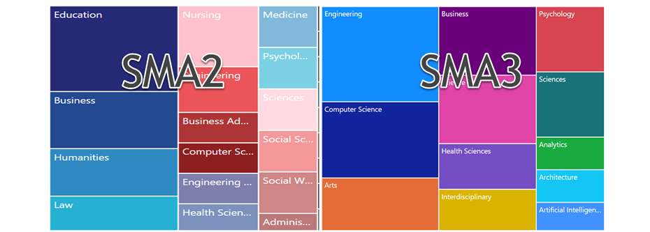
Both SMA2 and SMA3 asked universities to list their areas of strength and focus. In SMA2 they were recorded as a list of Strategic areas of program strength and expansion, and were not tied to funding or specifically measured. With a little interpretation (“Art & Sciences” or “Art”, “Sciences”?), SMA2 had the 21 universities identifying 169 areas of strength or expansion (Slide 5) , SMA3’s to be measured by institutions and validated by University Statistical Enrolment Report (USER)/MCU yielded 70.
When comparing the two the role of Education has gone from the number one shared area of strength and growth, shared by 9 universities in SMA2 to, to only Nipissing remaining when it is tied to performance funding. A likely strategic mistake as highlighted by Alex User, as it leaves Nipissing with little subject area diversification across their funding metrics, should the education discipline/sector/profession be affected by something (like a pandemic).
I’m not sure if SMA2, SMA3 or neither give a true representation of the Ontario university system’s current state of differention, per Weingarten & Deller, but comparing them in the dashboard below offers some insight.
You can select multiple items to compare by clicking them while pressing the ctrl key on a PC, Command key on a Mac. Adblockers sometimes block the Microsoft content.
")


